snowlover91
-
Posts
1,277 -
Joined
-
Last visited
Content Type
Profiles
Blogs
Forums
American Weather
Media Demo
Store
Gallery
Everything posted by snowlover91
-
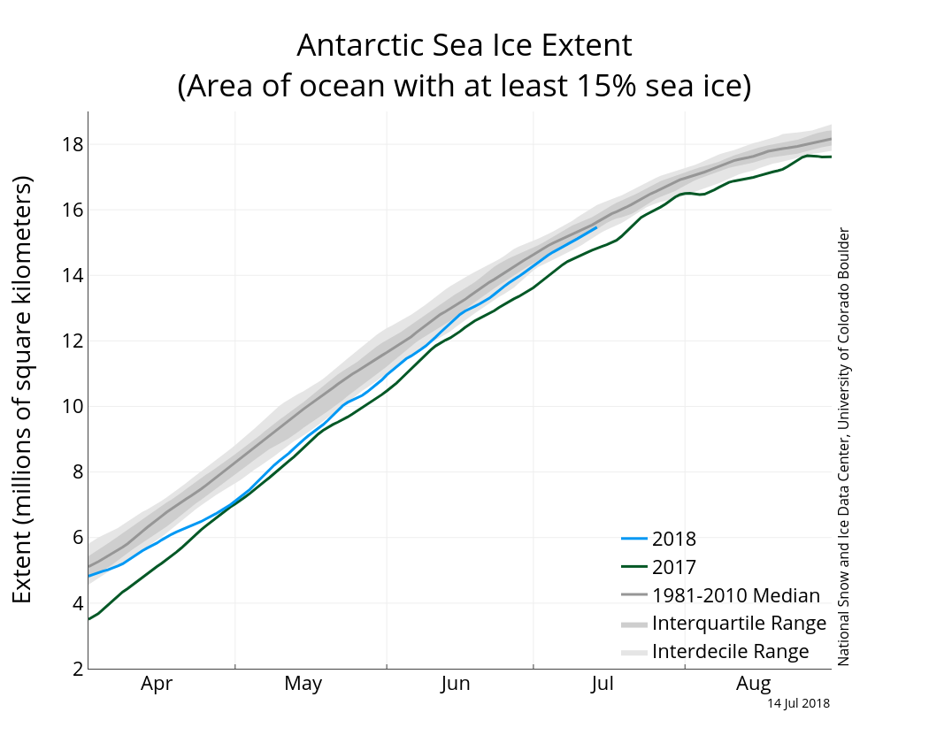
That chart is not a 1979-2018 long term median trend and is only comparing 2018 to the 1981-2010 median. This was never disputed or discussed; the ice this year is down but in 2014 it was at record levels and the long term trend from multiple charts already posted shows a small positive gain when averaged over the 1979-2017 period.
-
Even your graph shows a small long term gain in ice coverage. We aren’t taking about sea level rise here but the ice extent which has gained some since 1979.
-
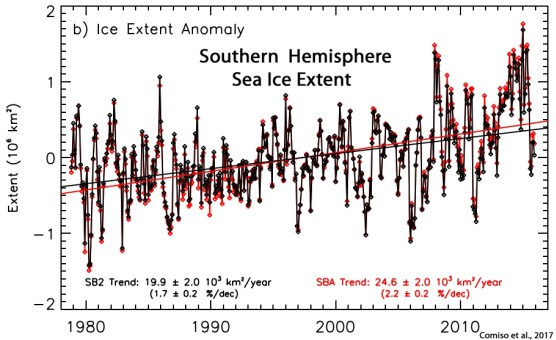
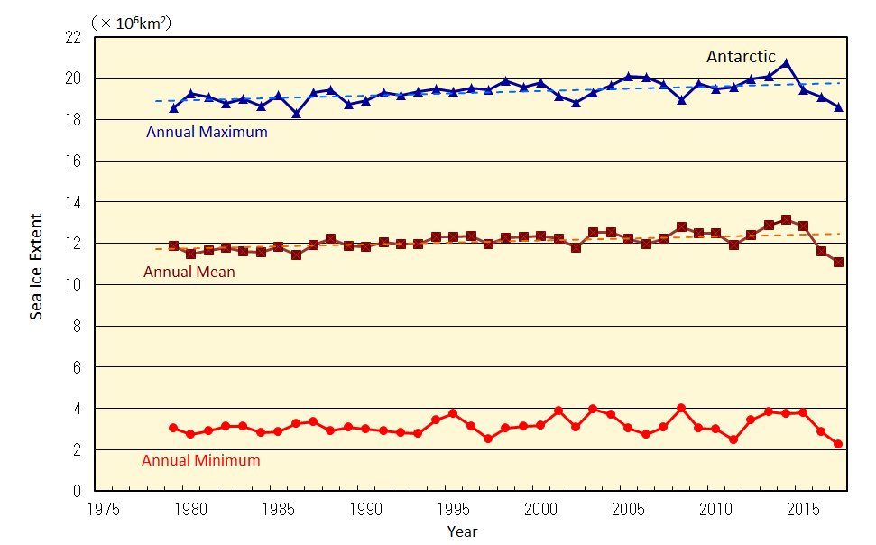
Did you not read the statement cited in the article? See below since you seemed to miss this chart and statement. This goes through 2017 which was 1 year ago and btw the climate models have not been accurate here as mentioned below. "Comiso Et Al., 2017 “The Antarctic Sea Ice Extent Has Been Slowly Increasing Contrary To Expected Trends Due To Global Warming And Results From Coupled Climate Models. After A Record High Extent In 2012 The Extent Was Even Higher In 2014 When The Magnitude Exceeded 20 × 106 Km2 For The First Time During The Satellite Era. … [T]He Trend In Sea Ice Cover Is Strongly Influenced By The Trend In Surface Temperature [Cooling].” The JMA asserts that the Antarctic has seen a small net growth since 1979. "Meanwhile, it is virtually certain that there has been a long-term trend of increase in the annual maximum and annual mean sea ice extents in the Antarctic Ocean since 1979. The former has increased by 0.023[0.010-0.035] x 106 km2 per year and the latter by 0.019[0.008-0.030] x 106 km2 per year. The annual minimum sea ice extent exhibits no discernible trend." http://www.data.jma.go.jp/gmd/kaiyou/english/seaice_global/series_global_e.html NASA themselves in 2015 released a study that indicated there has been positive gains in the ice sheet as well. https://www.nasa.gov/feature/goddard/nasa-study-mass-gains-of-antarctic-ice-sheet-greater-than-losses Here's one of the papers by Jay Zwally. https://www.cambridge.org/core/journals/journal-of-glaciology/article/mass-gains-of-the-antarctic-ice-sheet-exceed-losses/983F196E23C3A6E7908E5FB32EB42268 As I mentioned the assertions in that article about the Antarctic gaining ice are agreed upon by some well respected scientists and organizations. There are plenty of other papers out there with similar conclusions as well. I'm still waiting for the polar bears to go extinct like we were promised and the Arctic ocean to be ice free like has been predicted numerous times.
-
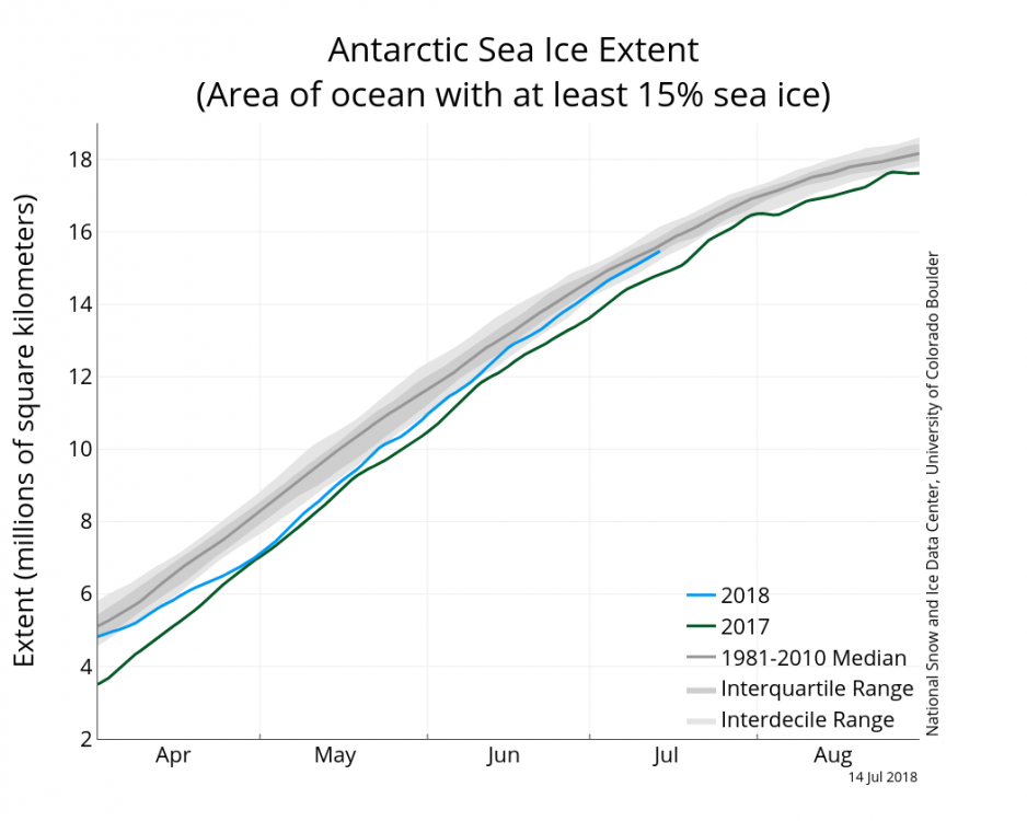
Sea ice is currently expanding quite nicely in extent. Still a ways to go but passing several recent years.
-
So no different than the random articles posted on here about random/unusual/historic warming in portions of the world? Got it. Btw the content in that article you linked is correct. The Antarctic has in fact been cooling and recently did hit record levels of ice cover in recent years. The cause for that is disputed among scientists but it is correct in that regard. By the way the “person who runs xx site believes xx so the article isn’t credible” is a logical fallacy. The OP cited Greenland SMB gain which is well documented on plenty of other sites. Sure, it doesn’t mean the earth is cooling or anything else but that specific article and the one you linked are both accurate in regards to Greenland SMB gain and the Antarctic.
-
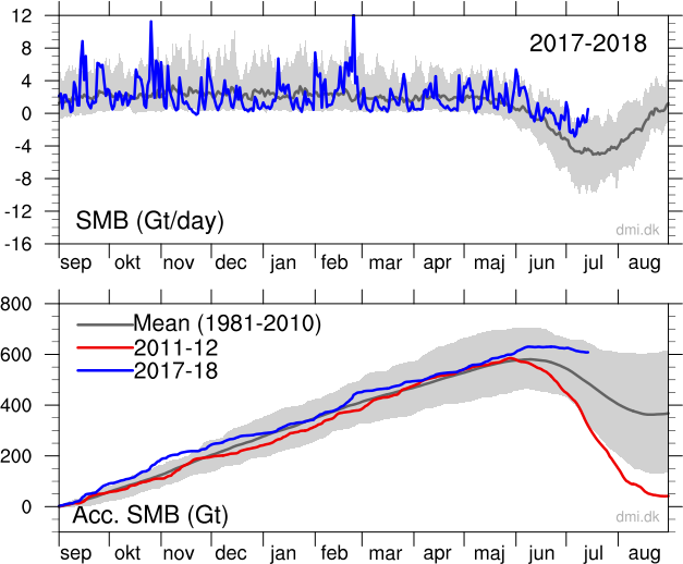
And yet the overall mass this year is one of the highest in recent years, neck and neck with 2014 and well above the 2004-2013 average...
-
According to this article here, average loss due to calving is around 500Gt and 2016-17 ended up being a wash or maybe even a slight gain in Greenland. As of right now we are at 600Gt so this year will likely be similar with a small gain if current trends hold. https://www.carbonbrief.org/guest-post-greenland-ice-sheet-2017
-
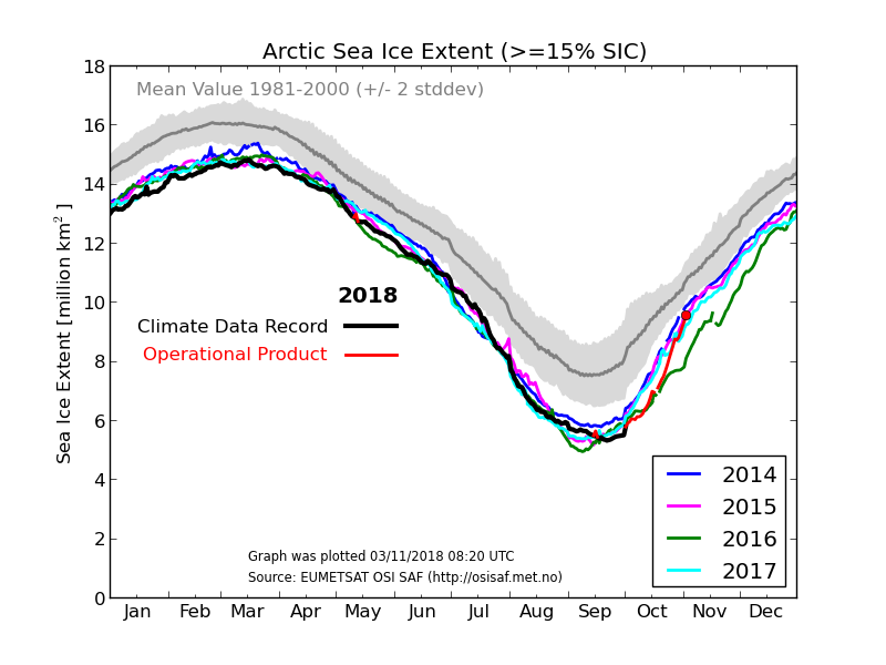
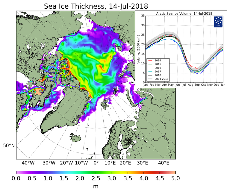
Does that graph go into 2018? Do you have links to these sources? Would be interested in checking them out further. I think its obvious that globally there are some changes going on in regards to the ice levels. The Arctic, Antarctic and SMB of Greenland have all showed much higher levels compared with previous years. In fact Antarctica is almost smack dab on the 1981-2010 median and the Arctic is a good bit higher than most recent years except 2014. It remains to be seen if this is just a blip or not.
-
Care to post some graphs which account for calving and discharge? No matter how you slice it it’s clear that this season’s SMB is well above average and is close to breaking levels we haven’t seen in the past 30 years.
-
Here comes the warm nose...
-
People are putting too much stock into the clown maps... a lot of people will be surprised tomorrow and not in a good way. I believe the 3km nam had the right idea.
-
HRRR is seemingly warmer because it’s not cooling the boundary layer temps as fast and slower with the heavy precipitation. Soundings still look good for Raleigh and west on it.
-
Fortunatley in this setup and with the wave moving through Friday morning the WAA is very weak. The warm nose looks like it’ll move in late Friday afternoon per NAM.
-
Here's the HRRR sounding for Friday AM at RDU along with the corresponding reflectivity map. That's a heavy, wet snow verbatim.
-
This is the RAP 17z run. It appears to be dynamically cooling a large area of the SE turning the rain into snow. It's one of the coldest models I've seen today so proceed with caution.
-
I think quite a few would be happy if this verified...
-
I'm not sure, I don't have access to them as I use the free wx.graphics and weather.us ones, but if they're using the kuchera method then they should give a better idea of amounts.
-
I believe the kuchera ratio factors several of those things in, but the output maps on the Euro are just the standard 10:1 so they are pretty misleading in events like this. For GFS/NAM the kuchera snow maps from pivotal are the way to go, they'll give a better indication of where those models see snow falling and sticking.
-
Remember when looking at the Euro output maps that is based off a standard 10:1 ratio. The ratios in this event will be more like 5:1 when you factor in the marginal temps aloft and warm ground. I'd recommend cutting those totals by 60% or so to get a much more realistic idea of what to expect on the ground.
-
I'm assuming some technical issues with it, none of the sites have it up... but haven't seen any official word on it yet.
-
@Lookout Thanks for posting that, the RAP is interesting as it seems to be a good bit colder than most models across the SE. Either it's picking up something the other models are missing or just out to lunch. I remember in some recent storms that the RAP seemed to be on the warmer end of guidance, more like the NAM. Perhaps it's picking up on less of a warm nose and/or more dynamic cooling to start?
-
GFS does not do well with thermal profiles or warm noses especially. I would look at the NAM warm nose modeled and shift it about 30 miles north/west and you'll get a good idea of what will transpire.. I mentioned it yesterday, this warm nose is no joke and many are going to be disappointed when it comes roaring in and changes them to rain. Best chance of snow in NC will be mountains and immediate foothills, especially in NW NC. Anything CLT to GSO and east will be mixing a lot per NAM.
-
Usually the Kuchera gives a little more accurate pictures, and even then I don't think it factors in ground temps and such. The Kuchera does a better job assuming ratios based on the atmosphere/dynamics and doesn't just default to the 10:1 that the snow depth and other maps seem to use. Since this will be a heavy wet snow, ratios will be pretty low around 5:1 or so.
-
Other than the 12z run today, the Euro has focused the heaviest qpf in NC for Raleigh and east and that’s also what GFS shows. I don’t go by the snow maps because of all the variables that play into it and the biases each model has that affect the outcome. For me, qpf placement/amounts and 500mb vort maps are the two areas I compare. GFS and Euro have been pretty consistent in that for the most part, especially the GFS.
-
Yep, it appears the GFS/EURO have this one down. I thought the GFS was out to lunch but it certainly has held firm and seems like it may be closest to reality.