psuhoffman
-
Posts
27,419 -
Joined
-
Last visited
Content Type
Profiles
Blogs
Forums
American Weather
Media Demo
Store
Gallery
Everything posted by psuhoffman
-
@C.A.P.E. @Bob Chill all of this pertains to week 2 since week 1 is toast...so everythOmg we’re discussing is low probability. Disclaimer out of the way.... I do think there is a crack open for something during the transitional period early week 2. It’s a long shot but not out of the question. Need timing to be in our side wrt wave spacing. So it’s not all bad. And what I’m about to say is dealing with stuff that’s post day 10 so there is a high chance it’s wrong anyways. That said I’m pretty disgusted with what I see long range. The CFS is ok as cape pointed out but I really put no stock in it. It’s been running “behind” on ideas for a while. Right now it’s still got the mjo idea of a run towards cold phases that other guidance had 72 hours ago. They have abandoned that. I suspect the cfs will catch on soon. Now im not buying the current look either, the tropical forcing had been a convoluted mess the models can’t handle for a while and they flip ideas every few days. But saying “it might be wrong” isn’t a great reason for optimism either. But hope I suppose. The current struggles don’t bother me much because we can recover from this quick and it’s December. A misplaced but otherwise compact tpv messing up the epo with an otherwise good look up top isn’t a long term winter long killer imo. But that look the eps and gefs has day 15 last night would be a disaster going into mid January. It might have been somewhat cold day 15 from the leftover day 10 shot, but roll that ahead and it would be a raging se ridge a few days later and that look, with a strengthening PV taking over from epo to NAO up top is a pattern that can ruin a LONG period and having that set in the second week is January is a Ji meltdown worthy event. Now before people head for bridges and say Psuhoffman cancelled winter...I think it’s wrong. It goes against the analogs and pattern progression I expect. But seeing that doesn’t make me feel better. I would rather have guidance on my side than not. So yea I’m slightly shaken by that day 15 look. I won’t really buy it though until it progresses consistently into day 10. But if that really is what’s coming going into the second week of January, then I will admit things are not going the way I expected.
-
Purely analyzing that cfs look, I actually like the Atlantic better than the pac. That’s a clear -NAO (east based though) with ridging over the top of the trough. The epo ridge is a west based epo. For the epo to really be ideal for snow we need it centered right along the coast and poking a ridge into northwest North America. That position without any Atlantic help would lead to a southeast ridge. You can see the se ridge trying but being muted by the NAO. That could set up an interesting battleground across our area. I’d take that look over a lot of the other options.
-
@showmethesnow @C.A.P.E. The look briefly looks promising around day 10. We get a dump of cold post day 10 from that very temporary -NAO -epo. There might be a very short window but att guidance says it’s pretty dry. But after that the look across guidance is honestly not that good for a significant snow. It’s hard to find any examples of a decent snowstorm with that h5 look. It’s not a shutout look...we can get some snow in most patterns except a big SE ridge in January. But we would be hoping for some kind of progressive wave. Anything amplified would cut. Sound familiar. Rather than try to work with that I’m just holding on to hope that it’s wrong after day 10. I don’t really want to spend prime climo stuck in a pattern where our best shot is to root for strung out waves. ETA: root for the GEPS.
-
For now I’m hanging my hat on the fact the Atlantic looks good through day 10. After that hopefully it’s wrong. But the issue is it slides the tpv east. That pushes the NAO ridge east. We really need that to either cross the pole or drop. But I’m going to be mildly annoyed if we waste the first extended NAO ridging for 2 weeks then just as the pac gets better the Atlantic goes to crap.
-
That’s a colder look... but not as snowy typically. I preferred the seasonal temps with ridging over the top look better.
-
One positive sign so far is that there wants to be some blocking up top. When the Atlantic was hostile the epo took over. Now that the tpv is on that side there is ridging on the Atlantic side. So far there have been enough mitigating factors to prevent snow here. But if we keep a somewhat favorable blocky high latitude profile through prime climo that is unlikely to continue.
-
Eps looks good day 10...and the trough lingers because of it day 11-15, but I don’t like the overall look day 15. It will be really hard to sustain any cold with that look up top. Luckily guidance has very low skill there past day 10 and all the guidance agrees on a pretty good look day 10. Just have to hope the Atlantic doesn’t completely break down like the euro indicates because nothing supports the pacific becoming favorable enough absent any Atlantic help. Doesn’t mean the pac stays hostile, just it looks ambiguous and not overly hostile or helpful in the long range which given the very conflicted tropical signals makes perfect sense.
-
Naw we get big snows from storms that start out 300 miles north of Toronto and dive due south all the time. All you can take from that range and that crazy nonsense is the gfs thinks the amplification and blocking of the pattern is likely to continue.
-
No one mentioned it, probably because its worthless...but the euro weeklies did have a nice NAO signature straight through the whole run. Pacific is mediocre at best the whole time though.
-
Looking at the individual members, there is agreement on a big cutter day 9-11 and then most of the members that cause the "trough" look in the east after that are just cold and dry with a big high parked over the east. There are some wet members...but they differ on things and take another cutter over after that. There really is no support among either camp for a frozen event despite the h5 look. Its split between cold/dry and warm/wet.
-
Ideally that is how it works...creating a feedback loop in our favor.
-
sooner or later the wave train of 50/50's has to pay off!!! We only need a couple good hits to make a winter here.
-
Run flee scurry
-
Yep...it was an attempt to corral all the dumb into this one thread. ETA: just so a debate doesn't start up I know when this thread started it was dry...and it was worth noting it...but it was fairly typical variance that happens a couple times a decade and not the emergency situation worth derailing EVERY discussion in every thread one person was making it out to be.
-
it seemed like such a dire thing .. its not like typical cyclical climate variance could have solved such an emergency situation
-
When will we get a drought update?
-
You're welcome. As for deer my wife knows a trick using Irish spring soap. Seems the deer don't like the smell. She puts it up at the corners and they have not been a problem.
-
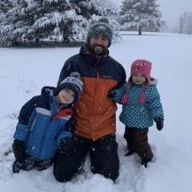
More recent pic...I need to catch up on weeding but have a 2 month old and I've been working long hours helping run a summer learning program.
-
I put a fence up around the garden. I lived the bottom foot with chicken fence to keep the smaller vermin out and then tucked the fencing underground about 6" for a foot to keep groundhogs from burrowing under. I also build a cage with bird netting for the strawberries. We haven't had an issue with the other berries. You can see in the background the strawberry cage. These are old from right after I finished laying out the garden and putting down the boxes and stone walkways. What is now the pumpkin patch is in the background.
-
Oh I know. I have a pretty large garden. Tomatoes, carrots, corn, peppers, raspberries, blueberries, watermelons, zucchini, green beans, snap peas, and 3 kinds of pumpkins. It's a pain when I have to water it all. But it's normal. There is a dry stretch almost every summer. Also sucks for my 2 acre lawn but there is nothing I can do about it. No way I am wasting that much water and overusing my well pump. Just have to hope it recovers when the rain comes again.
-
Typical cyclical patterns continue. We had a very wet spring. Now we are have a very typical summer dry spell that happens often. Some keep looking at qpf over too small timeframes to draw meaningful conclusions.
-
Don't feed the animals.
-
But that's pretty typical of a Nina winter.
-
Nina is typically dry here. We've had a two year Nina. It's ending now. We probably transition to a wetter long term pattern soon. It is typical cyclical variation. If this were to continue dry another 6-12 months then things would get serious and it would be a historically significant drought. I doubt that.
-
RIP