AstronomyEnjoyer
-
Posts
1,081 -
Joined
-
Last visited
Content Type
Profiles
Blogs
Forums
American Weather
Media Demo
Store
Gallery
Everything posted by AstronomyEnjoyer
-
Nest caught me on the tractor! (This is really just a test post)
-
Here's another of the lake zoomed in a bit.
-
30.6" in January here in Bradford. Has been a good month for inland folks with some elevation and latitude.
-
It really has, and thanks! I'm hoping I can get a shot with the ice up there but also have a clear view into VT over the next couple days. Unfortunately I don't think it'll end up happening that way though. Aviation weather wants to keep the low clouds for a while.
-
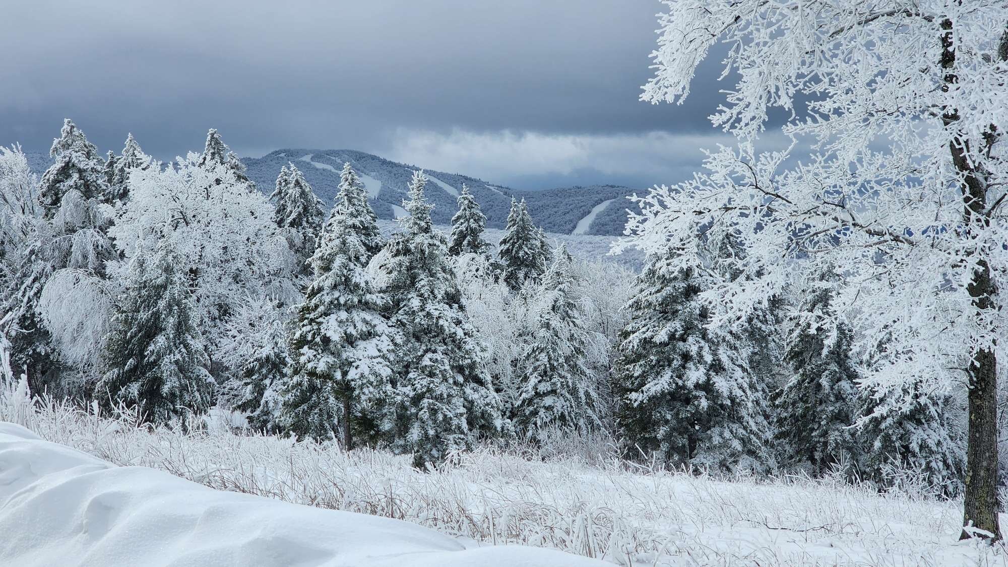
Saw the cloud deck was beginning to lift, so I decided to take a 15 min drive to where the wealthy keep their homes. That's lake Sunapee down below. The photos were taken from my truck at about 2000ft. Different world up there in terms of tree species, icing, the whole winter vibe in general. When it's really clear you can see nearly all the big VT ski resorts. You can also see the White Mountains including Washington to the north. Will try to get back up there on a clear day. (edit: because I forgot to mention, this is Newbury, NH.)
-
It was a Flop... February 2024 Disco. Thread
AstronomyEnjoyer replied to Prismshine Productions's topic in New England
Boo, that's not in the spirit of clown map posting! -
It was a Flop... February 2024 Disco. Thread
AstronomyEnjoyer replied to Prismshine Productions's topic in New England
I believe it was. -
It was a Flop... February 2024 Disco. Thread
AstronomyEnjoyer replied to Prismshine Productions's topic in New England
Exiting right! -
It was a Flop... February 2024 Disco. Thread
AstronomyEnjoyer replied to Prismshine Productions's topic in New England
The (South)ern New England shall rise again? -
It was a Flop... February 2024 Disco. Thread
AstronomyEnjoyer replied to Prismshine Productions's topic in New England
Yeah, only reason I posted that was because I was watching the evolution of the GFS on the full USA map and noticed some pretty striking colors forming over the LA area. That would also re-destroy all the roads in Death Valley that were just destroyed in I think summer of 2022? -
It was a Flop... February 2024 Disco. Thread
AstronomyEnjoyer replied to Prismshine Productions's topic in New England
This will fill in some dry lake beds. -
It was a Flop... February 2024 Disco. Thread
AstronomyEnjoyer replied to Prismshine Productions's topic in New England
Who said Feb 2010, lol? -
It was a Flop... February 2024 Disco. Thread
AstronomyEnjoyer replied to Prismshine Productions's topic in New England
I was so close to responding, "visiting friends in Connecticut" to that edit, but decided not to because it's important to me that I put up the facade of being a kind person. -
It was a Flop... February 2024 Disco. Thread
AstronomyEnjoyer replied to Prismshine Productions's topic in New England
California would be a better place if Lancaster were sucked into a black hole. -
It was a Flop... February 2024 Disco. Thread
AstronomyEnjoyer replied to Prismshine Productions's topic in New England
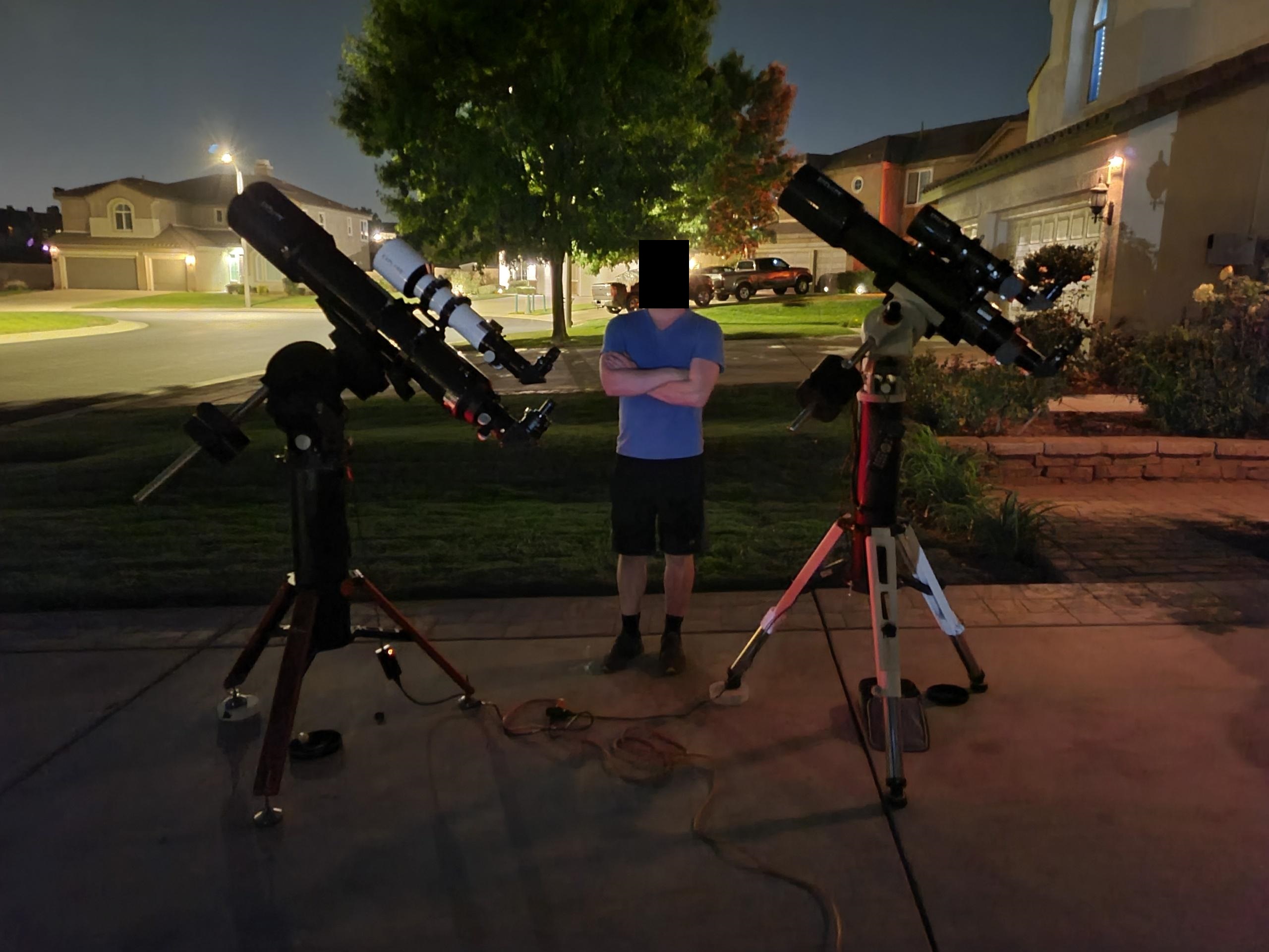
I don't! Makes the hobby way easier. Don't have to spend all that time aligning and pointing the telescope at objects - point it wherever and the view is the same! Can even use them inside if I want. You guys would be amazed at the utter blackness of space. -
It was a Flop... February 2024 Disco. Thread
AstronomyEnjoyer replied to Prismshine Productions's topic in New England
Yes it is! - this photo is a few years old now. Was working at Edwards AFB at the time and thus found myself living in the cesspit that is Lancaster, CA. -
It was a Flop... February 2024 Disco. Thread
AstronomyEnjoyer replied to Prismshine Productions's topic in New England
Dry weather and clear skies means astronomy time!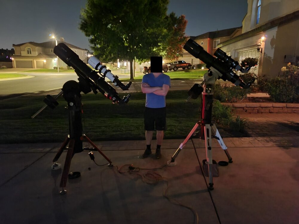
-
Well, at least up here, deep winter to close out January. Took these this afternoon in the backyard while playing a game of, "is there rock under there or is that just ice?" While February doesn't look to be off to a great start, hopefully you guys further south will get some love soon enough.
-
It was a Flop... February 2024 Disco. Thread
AstronomyEnjoyer replied to Prismshine Productions's topic in New England
Triple weenie. Although, it has literally broken my heart only one run apart already. -
It was a Flop... February 2024 Disco. Thread
AstronomyEnjoyer replied to Prismshine Productions's topic in New England
Probably Bermuda. -
It was a Flop... February 2024 Disco. Thread
AstronomyEnjoyer replied to Prismshine Productions's topic in New England
You've done it now Prismshine. People are gonna be fussy! -
It was a Flop... February 2024 Disco. Thread
AstronomyEnjoyer replied to Prismshine Productions's topic in New England
I agree - on one hand it's nice for snow retention (where I measure my snowpack is on a south facing yard) but on the other it's just dreary and miserable and when your main hobby is astronomy, clouds are a no go. -
26.8 here, with what I'm going to guess are the last flakes of January. Little ball snowflakes that bounce off everything - it's amusing to watch them roll off the roof.
-
It was a Flop... February 2024 Disco. Thread
AstronomyEnjoyer replied to Prismshine Productions's topic in New England
What are you talking about? That's already a massive strike at my place. And only 372 hours out? And on Feb 14th, Valentine's day? The only pink and red decorations I need are the pink and reds that this bad boy is generating on the clown maps, cause there's no way this is gonna break my heart. -
41.5" on the season, 15.6" snowpack. Been lazy updating here - also went down the data rabbit hole and found some CoCoRaHS data from a close by station to fill in for a December storm that I missed because I was hospitalized in Concord (all good now!).