

TheClimateChanger
-
Posts
4,593 -
Joined
-
Last visited
Content Type
Profiles
Blogs
Forums
American Weather
Media Demo
Store
Gallery
Everything posted by TheClimateChanger
-
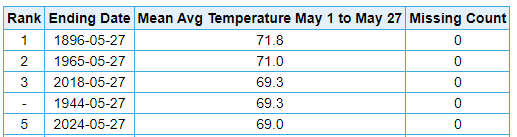
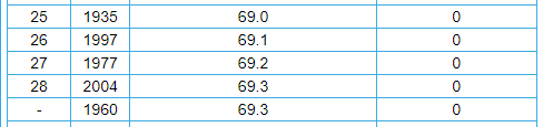
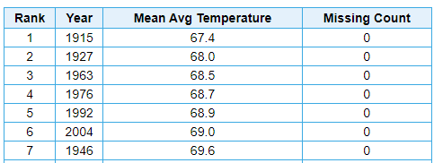
How do you always traipse in when cool or cloudy weather are about to hit, and silent the other 90% of the time? Through the first 27 days of May, there have been just 3 days below normal. Dayton is 5th warmest to date. For context, there have been 25 Junes that saw temperatures at or below 69F, and a handful of others that were just fractionally warmer. Two Julys were within 0.9F: And six Augusts at or below 69F:

-
Pittsburgh/Western PA Spring 2024
TheClimateChanger replied to Ahoff's topic in Upstate New York/Pennsylvania
It's too bad they don't take weather records downtown anymore. But if we tack on the average 2.6F increase relative to the airport from 1952-1979, then we can surmise the downtown mean would be around 50.8F on the year to date. Which is probably above the 20th century median at places like Oklahoma City and Knoxville, and well within the climate envelope of a place like Huntsville, Alabama and even "Hot-Lanta." Rumor has it people will still be moving to the sunbelt even when it's hotter here than it ever used to be in the sunbelt. -
Pittsburgh/Western PA Spring 2024
TheClimateChanger replied to Ahoff's topic in Upstate New York/Pennsylvania
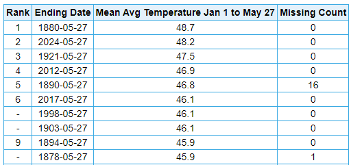
A couple other thoughts. On the year to date: Morgantown Pittsburgh For the period January 1 to May 27: At Oklahoma City, there have been 34 years that were the same or cooler than Morgantown's 2024. All but one occurred in the 103 years from 1891-1993. So basically, Morgantown's 2024 temperatures thus far have been as warm or warmer than about 1 in 3 years at OKC during the 20th century. Even PIT's average of 48.2F is as warm or warmer than 9 years at OKC - all which occurred in an 80 year stretch between 1899 & 1979. So, on average, about 1 in 9 years to date would have been expected to be the same or cooler at OKC during the early to mid 20th century. Knoxville, Tennessee has seen 13 years at or below 48.2F and an incredible 47 years at or below 49.8F - again the vast majority of which occurred in the late 19th or 20th century [and, in the case, of the former, exclusively in that timeframe]. Bristol/Johnson City, Tennessee has seen 44 years at or below 48.2F [out of 87 years total]. 69 out of 87 years have been cooler than 49.8F. There's a bit of elevation at the airport there, but only 306' from PIT and 282' from MGW. That's less than the elevation gain from downtown Pittsburgh to PIT. I only put this caveat due to expected pushback, but actually the elevation loss at Knoxville Airport is nearly as substantial than the elevation gain to Tri-Cities Airport.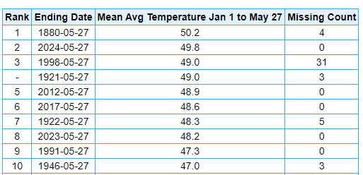
-
Pittsburgh/Western PA Spring 2024
TheClimateChanger replied to Ahoff's topic in Upstate New York/Pennsylvania
Would easily be the first seasonal warm record from the airport site. Closest previously is summer 1995, which finished 0.7F below the record hot summer (officially, 1900). Edit: Actually spring 2012, which finished at 56.3F, 0.3F below 1921. Either way, second place is guaranteed this year, because, even with the cooldown, the mean of the next 4 days will be somewhat above the existing average of 56.4F. So we can only go up from here - whether its one tenth or two tenths will decide whether we match 1921. -
Pittsburgh/Western PA Spring 2024
TheClimateChanger replied to Ahoff's topic in Upstate New York/Pennsylvania
Yeah, I updated to hedge my bets. Might wind up coming in a tenth of a degree below 1921, officially. -
Pittsburgh/Western PA Spring 2024
TheClimateChanger replied to Ahoff's topic in Upstate New York/Pennsylvania
Good shot at warmest spring on record as well, but it's going to come down to the wire due to the current cool down. 1921 finished at 56.6F. I think we'll probably finish around there. Also, it is the sixth warmest May on record to date, but I think we drop out of the top 10 there due to the current cool snap to end the month. Still probably top 4 or 5 at the airport site.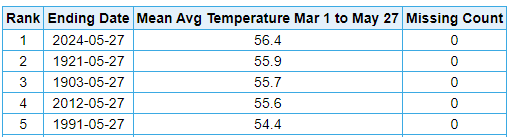
-
Pittsburgh/Western PA Spring 2024
TheClimateChanger replied to Ahoff's topic in Upstate New York/Pennsylvania
-
Pittsburgh/Western PA Spring 2024
TheClimateChanger replied to Ahoff's topic in Upstate New York/Pennsylvania
-
Occasional Thoughts on Climate Change
TheClimateChanger replied to donsutherland1's topic in Climate Change
Although that post characterizes is this as one of the worst heat waves, I see no evidence of a worse heat wave in the history of Mexico. Dating back to 1975, May is currently running about 4F warmer than any previous month at Mexico City. March and April were both the warmest on record in that interval, and April had been the 3rd warmest of any month. -
Occasional Thoughts on Climate Change
TheClimateChanger replied to donsutherland1's topic in Climate Change
-
Report: Another Year of Record Heat for the Oceans
TheClimateChanger replied to donsutherland1's topic in Climate Change
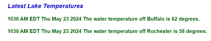
Lots of talk about the oceanic heat wave, but not much mention of the incredible marine heat wave in the Great Lakes. If we look at the water temperatures at the Buffalo crib, where water temperatures have been recorded continuously since 1927, we can see a new daily record was set by an astounding 4F. Also, a whopping 11F above the average reading for May 23rd. By contrast, the record low for today's date is 32F from 1971 - yes, it was still frozen. On this date in 1936, during the so-called hottest summer on record, the water temperature was a frigid 37F - the ice having broken up just about a week prior. Even Lake Ontario off Rochester is up to 58F today, as shown above.
-
Spring/Summer '24 Banter and Complaint Thread
TheClimateChanger replied to IWXwx's topic in Lakes/Ohio Valley
I think it's still early, no? They should have just started emerging over the past week. They don't fly until after they've molted. If you aren't seeing any activity by next week at this time, then I'm going to think something is wrong. -
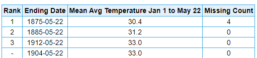
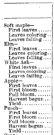
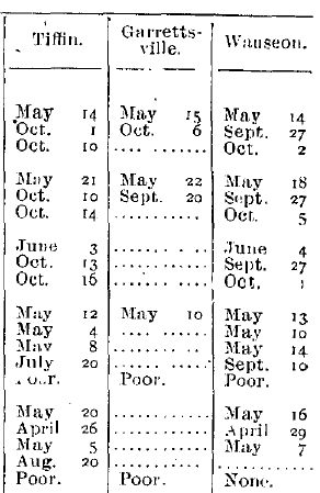
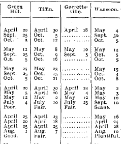
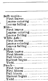
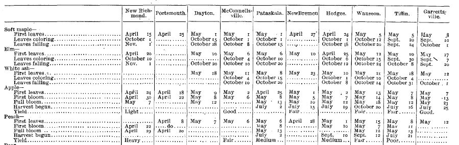
The late leaf out reported that year is consistent with the temperature data, though. 1904 was one of the coldest years to date on record. Dayton - only 1978 cooler Cleveland - only 1875 & 1885 cooler, tied with 1912 1907 is an interesting case (shown above for a few northern locations). Some tree species leafed out early, especially in the south. But the late blooming ash did not leaf out until mid to late May in most places. I looked at the temperature data, and there was a significant warm spell in late March (not as intense as 2012, but still quite warm), but then April and May were way below modern averages. Marquette in @weatherbo's territory has been nearly as warm in 2024, as Cleveland in 1904.

-
I mean 1904, even far southern Ohio didn't have ash leaves until the second to third week of May. Blows my mind.
-
Wow, I'm pretty shocked. I would have never thought your location in the Huron Mountains of the Upper Peninsula would have that many leaves already. When I look at the phenological reports from the Weather Bureau's Monthly Weather Review, you seem further along than northern Ohio used to be in the early 20th century, with the first White Ash leaves not being noted until the last week or so of May into early June. Even elm were just coming into leaf. Crazy how much that's changed in the past 100 years. 1907 1908
-
What tree species are we looking at here? Are these oaks? Are there any white ash? And if so, any leaves?
-
Pretty much bonus summer this month. At many of these locations, the coldest Julys are only about 1.5-2F warmer than this month, and all of them have seen numerous cooler Junes.
-
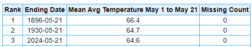
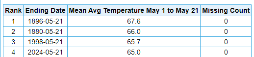
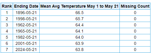
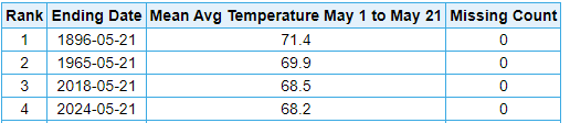
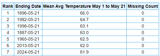
Looking like another scorching month... starting to feel like Groundhog Day at this point to be honest. Some areas could see their warmest May on record. At Mansfield, Ohio, the first three weeks of May have been the warmest on record (dating to 1916). Cleveland Toledo Mansfield, Ohio Detroit Lansing Dayton

-
Pittsburgh/Western PA Spring 2024
TheClimateChanger replied to Ahoff's topic in Upstate New York/Pennsylvania
Jumped up to 8th place already on the month to date, with another ridiculously warm (relative to average) day coming in today. Low was just 67F this morning.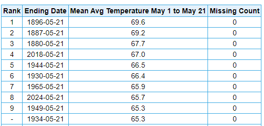
-
A rare dust storm warning for parts of Illinois.
-
Wow! Not the earliest 90F+ reading on record, but only 4 years (since 1871) have seen an earlier 90F+ reading at Cleveland. 1953: May 10, 90F; 1959: May 6, 92F, May 20, 91F 1962: May 14, 91F; May 18, 91F; and May 20, 91F 2017: May 17, 90F
-
Occasional Thoughts on Climate Change
TheClimateChanger replied to donsutherland1's topic in Climate Change
The mean temperature at Philadelphia would have to be like 60F already if there was a 12F UHI. That's a bunch of nonsense. -
Occasional Thoughts on Climate Change
TheClimateChanger replied to donsutherland1's topic in Climate Change
Lol. 12 degrees of urban heat island effect in Philly. Yet it's only 7 degrees warmer than the coldest spot in the entire state, at over 2,000 feet elevation near the New York border. Maybe if you are measuring the temperature of asphalt and rooftop, but I'm still having trouble verifying this from actual data. I can believe your article or I can look at actual data that shows it is BS. Bradford Philadelphia

-
Occasional Thoughts on Climate Change
TheClimateChanger replied to donsutherland1's topic in Climate Change
I'm just not seeing it. Here is some data for the year to date from the Mid Atlantic. It's almost like temperatures vary pretty consistently with latitude and elevation, and any impact from population is pretty small (maybe a degree or so). Population figures given are for the county or district in which the airport is located [I used Loudon County for IAD, which spans two counties]. Where is this 3 to 12C figure coming from?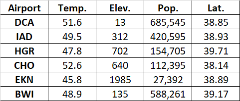
-
Occasional Thoughts on Climate Change
TheClimateChanger replied to donsutherland1's topic in Climate Change
Can somebody help me find the 3-12C urban heat island effect? I'm having a lot of trouble finding it in the actual data.


