

TheClimateChanger
-
Posts
3,203 -
Joined
-
Last visited
About TheClimateChanger

-
The average high temperature YTD for Detroit is 43.0F, which is 25th warmest [of 152 years in the threaded history], placing it around the top 16% of all years. Although only 3 years of the past 9 have been cooler (2022, 2019 & 2018).
-
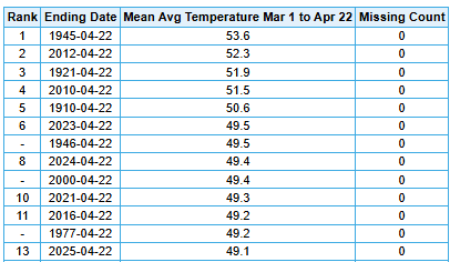
Another top shelf one today, albeit a tad on the warm side with highs climbing into the 80s. Definitely a continuation of the same theme we've seen since March 1. In the Motor City, this is 8th warmest spring to date, by mean high temperature (Detroit threaded record - 152 years). Prior to 2010, only 4 years were warmer (1945, 1946, 1976 & 1977). Definitely some elite company in there. I remember looking at spring temperatures in years like 1945, 1946, and 1921 as unbelievably hot back in the 90s. 4th warmest at Detroit City Airport (92 years).
-
Interestingly, the warmth has been driven more by high temperatures than low temperatures. I know certain people don't like using daily average temperature, but, in this regime, I bet those same people would eschew the use of daily maxima.
-
What season are we in now? Fake summer? The brutal thing about this year was losing all of my magnolia blossoms before they opened. Just devastating. Fake spring came so early that it took them out in the cold snap earlier this month.
-
Occasional Thoughts on Climate Change
TheClimateChanger replied to donsutherland1's topic in Climate Change
Not sure how I feel about this. On the one hand, states like Pennsylvania and New York have been greatly harmed by the advent of air conditioning and the anti-labor policies of the southern United States (which have drawn capital southward due to lower wages, less benefits, etc). Moreover, the south was responsible for the death of 400,000 Americans just 160 years ago, the bulk coming from states like New York and Pennsylvania, and have never received appropriate punishment (IMO) for that crime. A great amelioration of the climate of New York and Pennsylvania is ongoing which should be a boon to the region. But instead we are going to block out the sun so that Texas, Arizona, and Florida will be better off. And you know who is going to pay for it? All of us, rather than the lion's share falling on places that stand to benefit the most. We'll probably end up subsidizing their insurance as well. I say let states like Arizona, Texas, Florida etc. handle it. They hate federal involvement anyways - let alone international cooperation. So let them come up with their own solutions. -
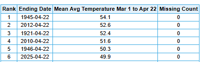
Looking like we may make a push for one of the warmest spring seasons on record if this continues into May. Currently, sitting in 9th place, with a good chance of making a push for top 5 by the end of April. April will be the third consecutive above normal month at PIT, and 21st out of the last 22 months.
-
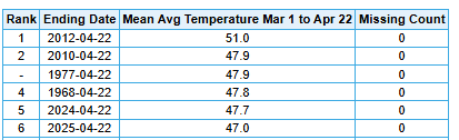
You would think by the characterization of these threads (March & April) that this has been a cold and miserable spring. In fact, it's been one of the most favored springs on record with excellent planting conditions. By the end of the month, many places should be looking at a top 10 warmest spring season to date. Dayton, Ohio, for instance, where the thread creator resides, is currently in 11th place, which places this season around the 92nd percentile of all years! For the record, 1945 & 1946 were not observed at the airport. Temperatures were quite a bit cooler at the airport site:
-
Central PA Spring 2025
TheClimateChanger replied to canderson's topic in Upstate New York/Pennsylvania
One of the most favored springs in the storied history of this Commonwealth to date. Models show continued warmth into the month of May. I suspect that, by the end of April, most places will be top 5-10, with some of the shorter period of record sites perhaps making a push for warmest spring on record. Outstanding conditions for spring planting. Pittsburgh [9th warmest] DuBois [4th warmest] Bradford [3rd warmest] Harrisburg [13th warmest] Williamsport [9th warmest] Altoona [6th warmest] Reading [6th warmest] Allentown [8th warmest] Philadelphia [8th warmest]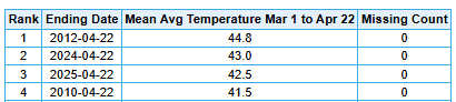
-
Hopefully, it’s not too smoky of a summer. That could keep things a little cooler due to limited insulation. Definitely a bit of a milky haze here today. Not sure what it looks like on the east coast.
-
Wind never died off completely. More of a pressure gradient than would typically be encountered in the summer. Although the high today (86) was no slouch either - just one degree off the daily record. Actually, there have only been 14 years in which it reached higher than 86F in the month of April, and another 11 where it topped off exactly at 86F. And only two years since 1925 have seen days more than 1F warmer than today in April. So from a historical perspective, this is about as warm it gets in April.
-
Also, the 7 am temperature of 74F was the highest observation for that time at PIT.
-
Crazy stuff. Here are some notable highs and lows from April 18, 1875, from ThreadEx sites: New York, New York: 32/25 Albany, New York: 32/21 Philadelphia, Pennsylvania: 34/25 Baltimore, Maryland: 34/26 Washington, D.C.: 33/25 Toronto, Ontario: 29/10 Buffalo, New York: 23/14 Rochester, New York: 25/15 Pittsburgh, Pennsylvania: 25/14 Morgantown, West Virginia: 27/18 Cleveland, Ohio: 26/17 Toledo, Ohio: 34/12 Detroit, Michigan: 33/8 Lansing, Michigan: 33/8
-
Thankfully nothing like 1875 today.
-
Definitely looking forward to summer. Hopefully, it's another one like last year which saw 24 days of 90+ at KPIT. Forecast calls for highs near 80F tomorrow, a big change from the frosty start today!
-
While yesterday's severe threat ended up staying well south of the region, there could be some feisty (thunder)showers this afternoon. While the activity looks to stay sub-severe, there could be some small hail and wind gusts up to 50 mph. Special Weather Statement National Weather Service Pittsburgh PA 1116 AM EDT Tue Apr 15 2025 OHZ039>041-048>050-057>059-068-069-PAZ007>009-013>016-020>022-029- 031-073>078-WVZ001>004-012-021-509>513-152100- Tuscarawas-Carroll-Columbiana-Coshocton-Harrison-Jefferson OH- Muskingum-Guernsey-Belmont-Noble-Monroe-Mercer-Venango-Forest- Lawrence-Butler-Clarion-Jefferson PA-Beaver-Allegheny-Armstrong- Washington-Greene-Westmoreland-Higher Elevations of Westmoreland- Fayette-Higher Elevations of Fayette-Indiana- Higher Elevations of Indiana-Hancock-Brooke-Ohio-Marshall-Wetzel- Marion-Monongalia- Ridges of Eastern Monongalia and Northwestern Preston-Preston- Eastern Preston-Western Tucker- Including the cities of New Philadelphia, Dover, Carrollton, Malvern, East Liverpool, Salem, Columbiana, Coshocton, Cadiz, Steubenville, Zanesville, Cambridge, Martins Ferry, St. Clairsville, Caldwell, Woodsfield, Sharon, Hermitage, Grove City, Oil City, Franklin, Tionesta, New Castle, Ellwood City, Butler, Clarion, Punxsutawney, Brookville, Aliquippa, Beaver Falls, Ambridge, Monaca, Pittsburgh Metro Area, Kittanning, Ford City, Washington, Canonsburg, Waynesburg, Murrysville, Greensburg, New Kensington, Lower Burrell, Latrobe, Monessen, Ligonier, Donegal, Uniontown, Champion, Ohiopyle, Indiana, Armagh, Weirton, Follansbee, Wellsburg, Wheeling, Moundsville, New Martinsville, Fairmont, Morgantown, Coopers Rock, Kingwood, Bruceton Mills, Terra Alta, Rowlesburg, Hazelton, Parsons, Hendricks, and Saint George 1116 AM EDT Tue Apr 15 2025 ...GUSTY CONDITIONS AND SMALL HAIL THROUGH THIS AFTERNOON... Showers and thunderstorms may produce small hail and strong wind gusts up to 40 to 50 MPH through this afternoon. Outside of showers and storms, winds will be sustained around 20 to 25 MPH with gusts up to 40 MPH. $$ TC
