chubbs
-
Posts
4,165 -
Joined
-
Last visited
Content Type
Profiles
Blogs
Forums
American Weather
Media Demo
Store
Gallery
Everything posted by chubbs
-
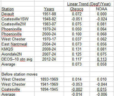
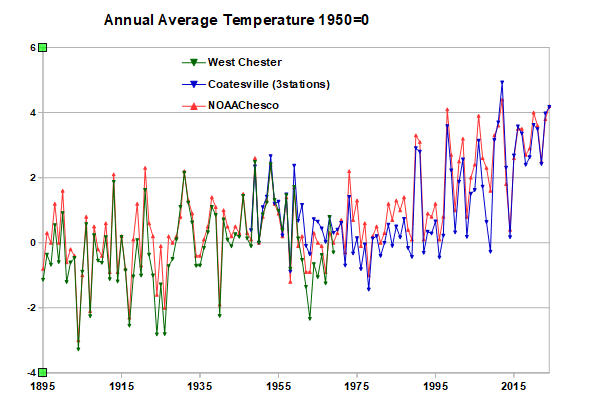
The only adjustment to the West Chester and Coatesville raw data is to take out the temperature difference between the two stations by setting 1950 to zero. The year-to-year change in temperature is exactly what the raw data shows at Coatesville and West Chester. A little over 4F warming between 1894 and present, the same as NOAA. Like I said above you are not even close to what the raw data is showing. Below is a comparison of individual stations to NOAA, excluding station moves of course. The agreement is very good both recently and before the major station moves.. If anything NOAA is underestimating the recent warming in Chester County. Why don't you provide the equivalent trend values for your Chesco average so we can see how you stack up.
-
Not even close to being right. You are cherry-picking the data you like, the temperature values, and ignoring the rest of the information associated with the raw data: the station locations, the station moves, and the relative temperature between stations. Easy to spot the station moves and other major changes by tracking changes in the relative warmth of the Chesco stations. Its well proven science. That's why NOAA's results are different than yours. I get very similar results to NOAA by using the raw data at West Chester (before move) and Coatesville (after move) and avoiding the station moves. We saw in the other thread that the individual station data agrees with NOAA. Why wouldn't it? NOAA uses all the information and well proven science.
-
Bluesky.png.3a4f05b5c42ebf3e96141657cd377825.png)
-
More charts
-
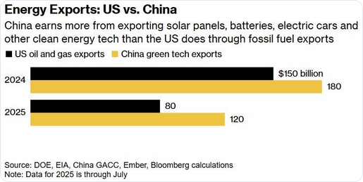
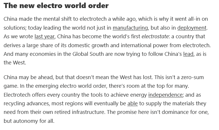
We're currently the biggest drag on climate progress, along with other big oil producers: Russia and the Middle East. The global south is moving quickly to clean tech for energy using gear they are buying from China. We are losing a race that we don't even know is going on.
-
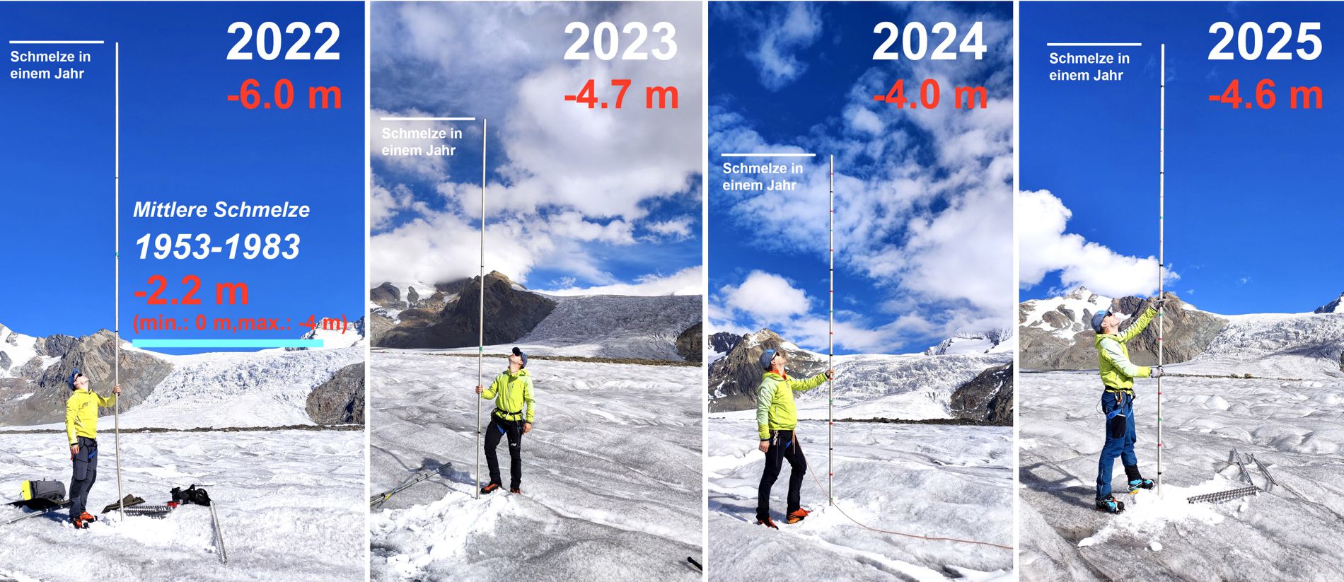
Switzerland lost 3% of its glacier mass this year. The 4th highest yearly loss. https://scnat.ch/en/uuid/i/9d883a30-136c-55b8-8cde-a6b4c1851dee-And_Swiss_glaciers_continue_to_melt

-
Here's a new one, recently emerging Antarctic methane seeps. Could be an important climate feedback. A priority for research funding I would think; but, we will have to rely on other nations to carry the ball. https://www.nature.com/articles/s41467-025-63404-3.pdf
-
Boston 2015/16-now, 34.7, matches BWI 1951-80, 34.6.
-
2015-16 to present matches Richmond's average winter temp 1951-1980 - 38.4.
-
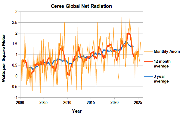
CERES has been updated through July. Recent months have been increasing erratically a sign that the enso-cycle bottom has been passed. The three-year average net radiation remains at a high level, well above the initial heat imbalance when CERES started collecting data in 2000. The recent net radiation uptick is also consistent with the large rise in ocean-heat content in 2nd quarter which was posted above. Both energy balance metrics indicate that the earth continues to warm rapidly.
-
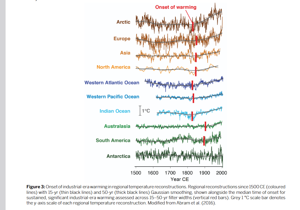
Found this 2017 article in the Pages2k magazine that provides a nice summary of regional temperature change since 1500. There is regional variation in the detectable onset of man-made warming. As you suggest warming was already detectable by the mid-1800s over the ocean and Northern Hemisphere land masses. Makes sense as greenhouse gas concentrations started to rise slowly by 1800. https://pastglobalchanges.org/sites/default/files/download/docs/magazine/2017-1/PAGESmagazine_2017(1)_71-74_2k.pdf

-
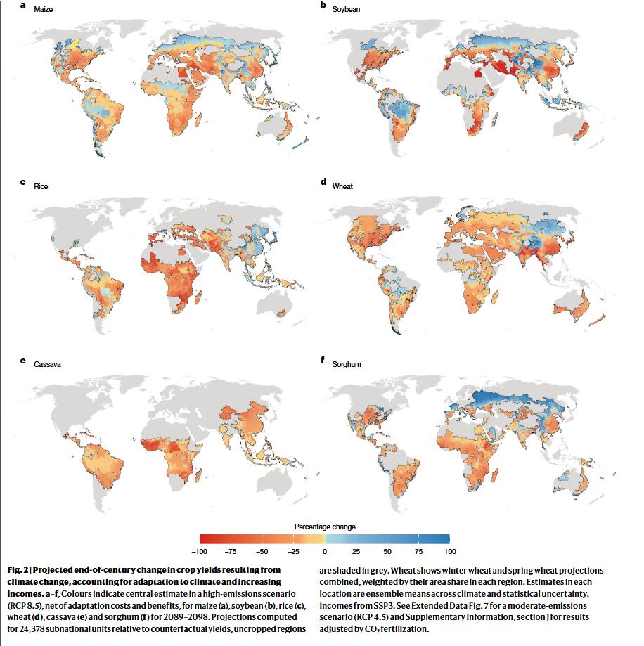
A quick check indicates that CO2science is not a balanced website. Its advocating against US regulation of CO2 emissions and focusing on the benefits of CO2 on plant growth without acknowledging offsetting adverse impacts. I'd put it in the climate denial camp. I ourworldindata piece I linked above is more trustworthy. Recent gains in yields are mainly from improved seed genetics and increased fertilizer and other inputs. You have to strip that out to get climate change impacts. I googled up this recent Nature paper which finds significant future negative impacts on agriculture, even after farmer adaptation, albeit from a high emissions scenario. I haven't gone through the literature review section but that would be a good place to start on recent scientific work in this area. https://www.nature.com/articles/s41586-025-09085-w.pdf

-
Do you have a reference for this? Per the articles below, we have had larger crops due to technology improvement not climate change. The impact of climate change depends on the crop and region. No large net impacts so far. On a global average, doesn't look like a disaster in the future either; but, some regions and crops may have significant negative impacts. Also need to consider extreme events which will pack a bigger punch in a warmer world. A bad year can be destabilizing regionally. https://ourworldindata.org/crop-yields-climate-impact https://ourworldindata.org/will-climate-change-affect-crop-yields-future
-
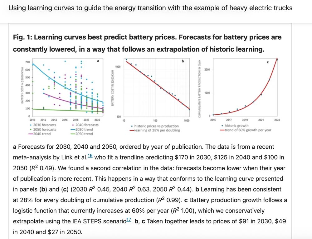
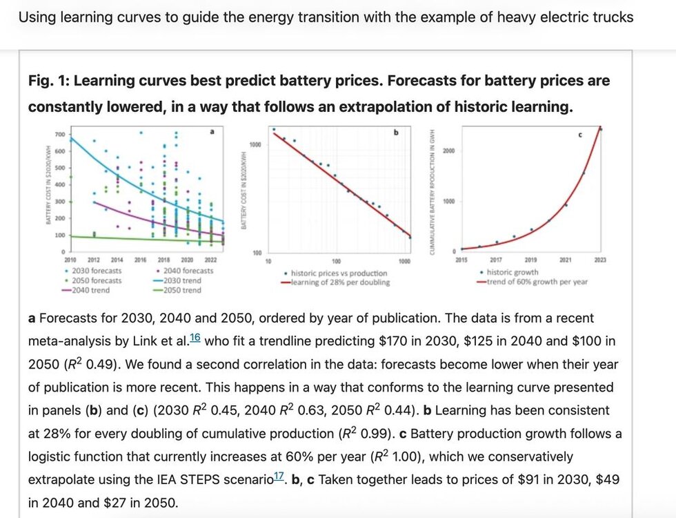
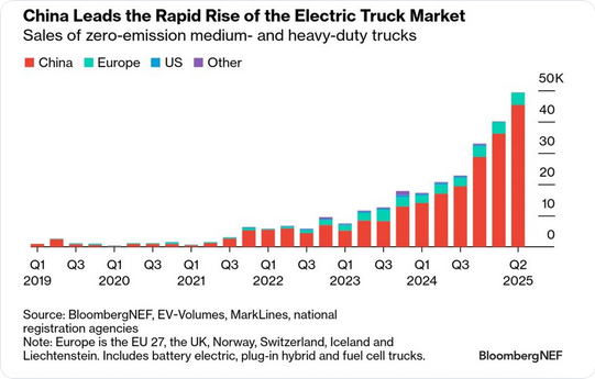
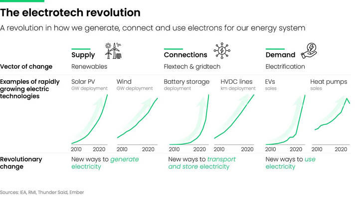
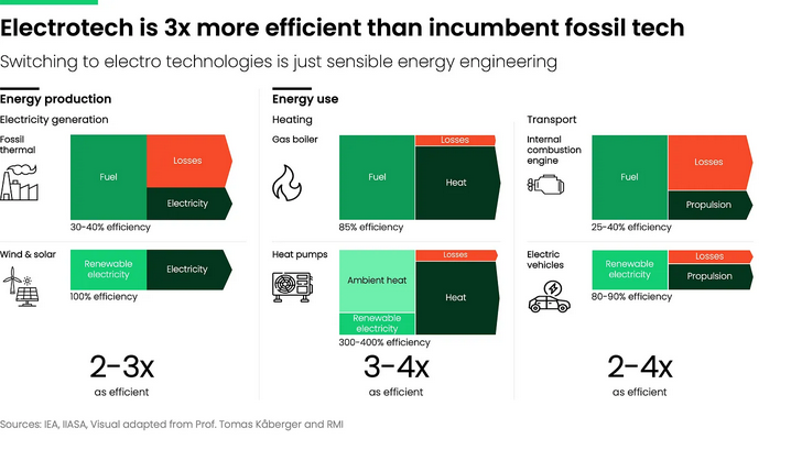
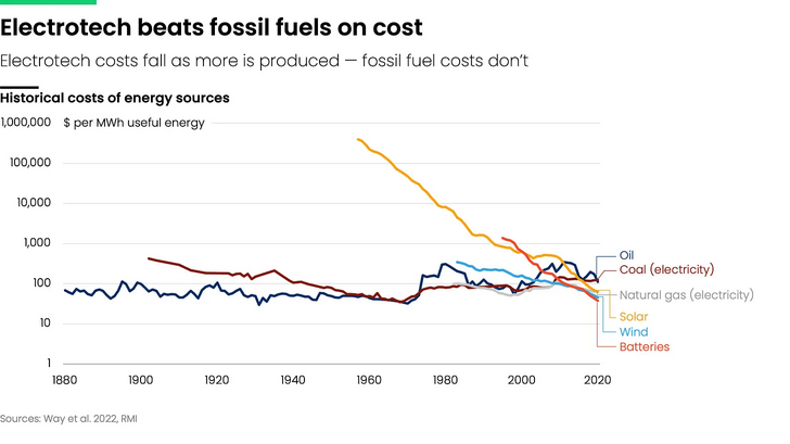
Battery costs are declining along well established cost curves. This ongoing cost decline is hammering the competitiveness of fossil fuels. Cheap batteries mean solar and wind are no longer intermittent and transportation is readily electrified. This article shows how battery-electric trucks will quickly become more cost-effective than diesel. This is being driven by China which has recognized the long-term strategic opportunity. They are electrifying their economy to reduce oil imports and sell increasing amounts of high value gear to the rest of the world. Meanwhile our leadership is in denial. Doubling down on outmoded energy technology. Going to be tough to be competitive if we are uncompetitive in energy. https://www.nature.com/articles/s44333-025-00029-5.pdf
-
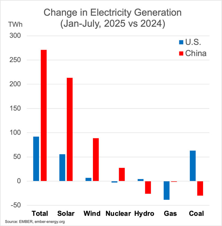
China's CO2 emissions are peaking not accelerating. That said China coal use is massive and coal interests are putting up a fight. Its unclear how China's policy towards coal will evolve. https://www.carbonbrief.org/analysis-record-solar-growth-keeps-chinas-co2-falling-in-first-half-of-2025/ https://energyandcleanair.org/publication/chinas-coal-is-losing-ground-but-not-letting-go/
-
Trump's speech showed how unprepared the US is becoming for the future. https://electrotechrevolution.substack.com/p/rewiring-the-energy-debate?utm_source=substack&utm_campaign=post_embed&utm_medium=web
-
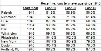
Here are some snow stats for I95 cities. Last 10 years have been below normal at all cities. Philly to Boston are above average over last 30 years. This year 95/96 will be dropped from 30-year average, so 30-year averages are likely to drop.
-
Wildfire smoke is having an increasing US health impact. Likely also cooling our summers. https://bsky.app/profile/shannonosaka.bsky.social/post/3lz4nvt3eqc2f https://www.nature.com/articles/s41586-025-09611-w#Sec4
-
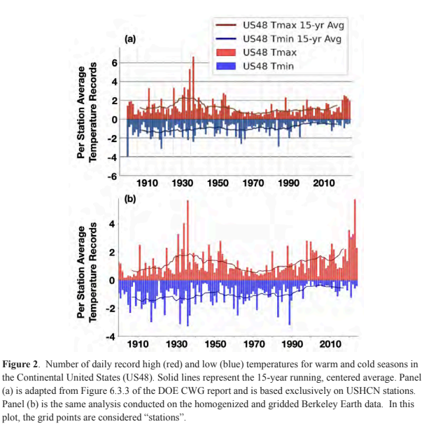
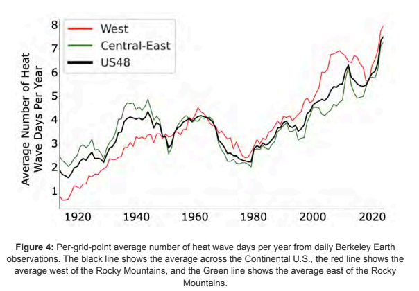
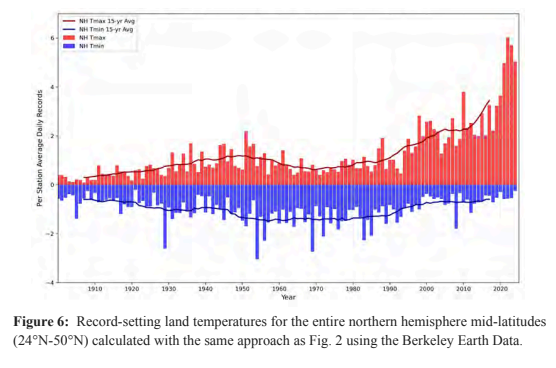
Some charts from the recent climate experts review of the recent DOE CWG report. The first chart shows how misleading taking an average of GHCN stations is because: 1) the stations are not spread uniformly across US and the 2) station network has changed with time both equipment and station locations. The second chart shows that a proper analysis shows heat wave days are increasing in the US and are now well above 1930s levels. The final chart shows that mid-latitude extreme temperatures are increasing much faster outside of the US. https://drive.google.com/file/d/1knIpC4vGrZXDsrF13RC2CujCjhbILgaa/view?usp=sharing
-
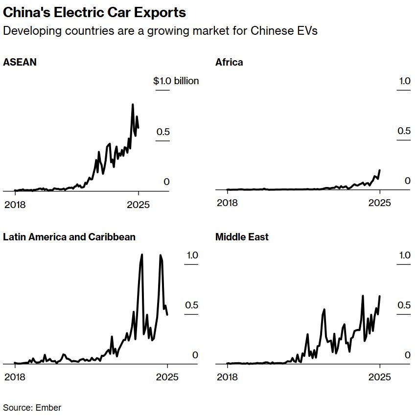
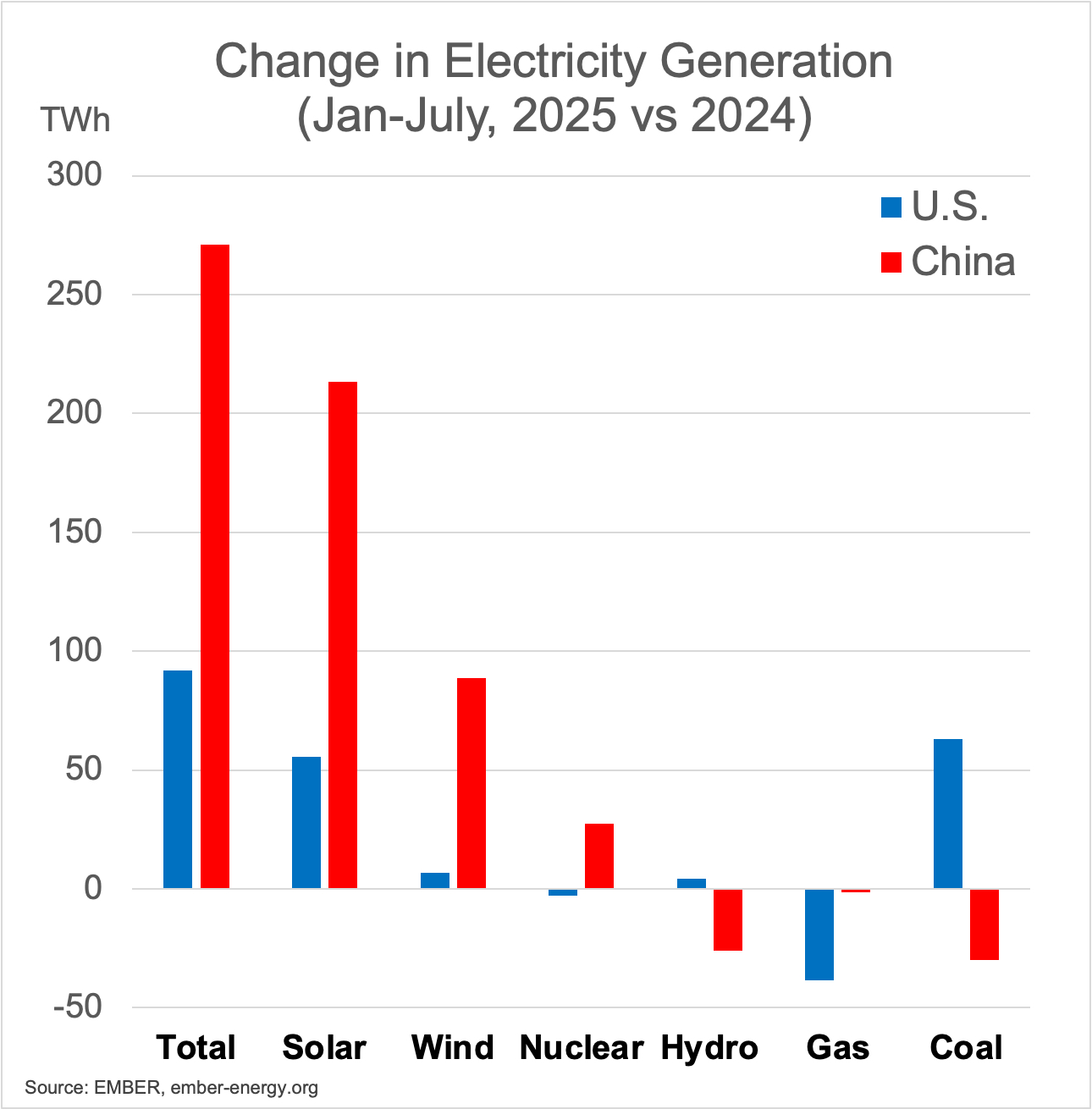
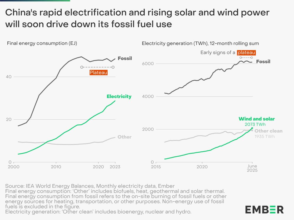
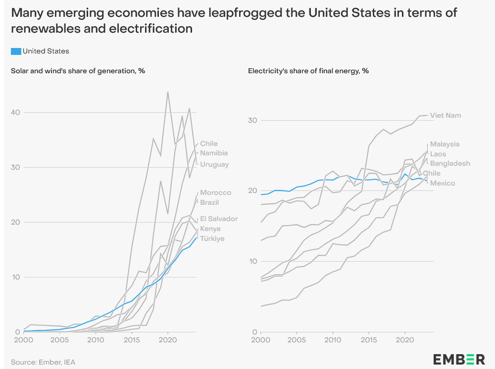
Clear we have passed an energy tipping point, with fossil fuels becoming increasingly uncompetitive. China's large manufacturing scale key in driving down costs. Countries without entrenched fossil fuel interests are leading the way and China will sell them the gear. https://ember-energy.org/latest-insights/china-energy-transition-review-2025/
-
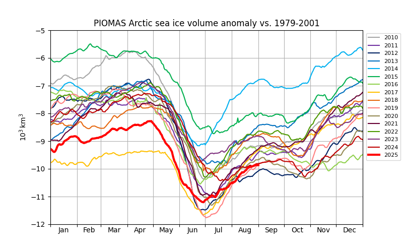
PIOMASS sea ice volume is currently number 2 behind 2012. Volume losses were unusually low this year in June, similar to 2017 in that regard.
-
-
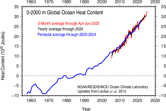
Ocean heat content in the 0-2000m layer has jumped up this year, recovering from a nino-related dip. A sign that warming at a fast clip continues.
-
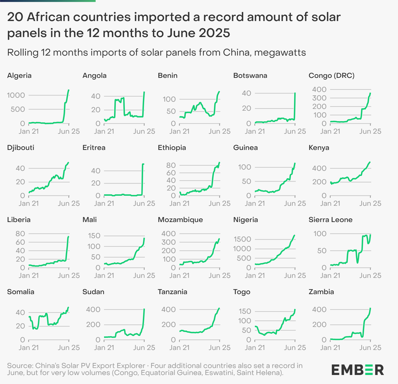
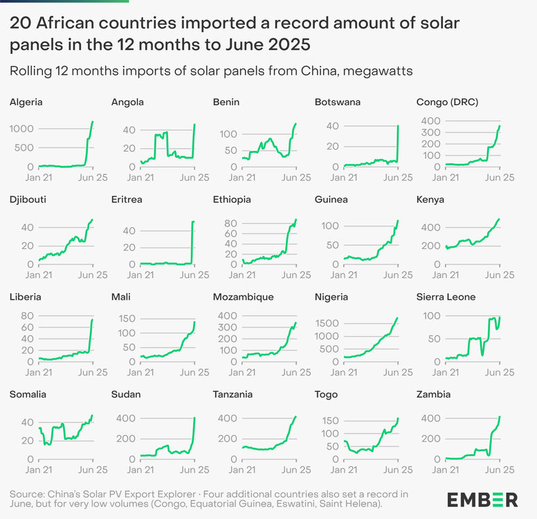
Solar is accelerating rapidly in Africa. This is mainly due to economics, lower cost of solar panels and batteries.

-
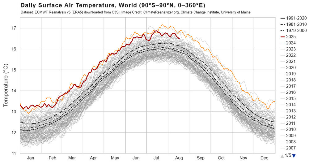
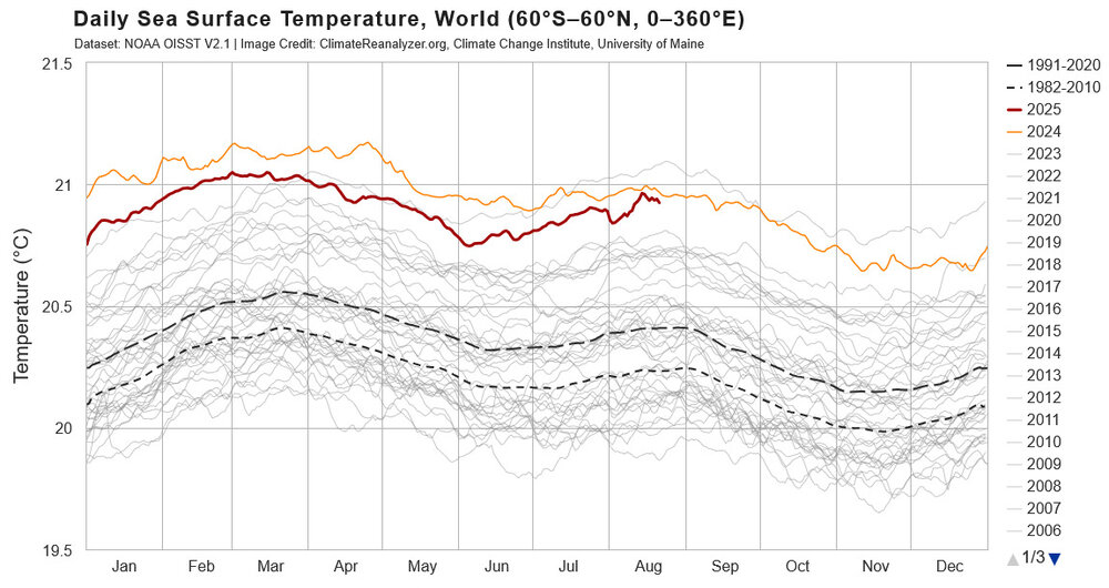
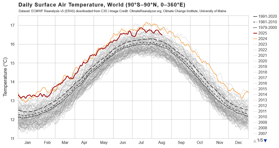
It is interesting to compare the current standing and recent trends in SST vs global temperatures. Comparing to 2024, SST have risen through the year particularly in summer months, while global temperatures have cooled relative to 2024. Difficult to compare 2025 to 2023 because of the strong rise in temperature in 2023, but just looking at August, both SST and global temperatures are somewhat cooler in 2025 vs 2023. Comparing 2025 to pre-2023 years, SST is currently warmer than any year by a good margin, while global temperatures are not well clear of the pre-2023 years. Taken as a whole, 2025 SST is like 2023, unusually warm for the enso condition; but, unlike 2023, global temperatures are not unusual for the enso state. Mid-latitude marine heat wave probably playing a role . Will be interesting to track as summer turns to fall. Guessing SST will cool will warm relative to other years and global temperatures will warm; but, we will see.